Border
The Border component is used to wrap one single child component with a styled border around it. It's great for highlighting parts of your interface like status messages, input boxes, or grouped UI elements.
Usage
Here's how you create a border around any component:
auto border = std::make_shared<Border>(child, border_style);
Note: A border can only wrap one child component. If you need to group multiple components, use a layout component like
FlexorListinside the border.
Styling with BorderStyleBuilder
You can customize the appearance of the border using BorderStyleBuilder, which gives you full control over the visual design of the border.
Here's a complete example:
  auto border_style = BorderStyleBuilder()
    .set_color(ansi::FG_GREEN)
    .set_background_color(ansi::BG_DEFAULT)
    .set_title("Success!")
    .set_title_alignment(TitleAlignment::Center)
    .set_characters(BorderPreset::DOUBLE)
    .build();
Available Customizations
-
set_color(ansi::FG_COLOR)Sets the foreground color of the border. Choose any color fromansi. -
set_background_color(ansi::BG_COLOR)
Optional background fill color behind the border characters. -
set_title("text")
Adds a title to the top border. -
set_title_alignment(TitleAlignment::...)
Aligns the title:TitleAlignment::LeftTitleAlignment::CenterTitleAlignment::Right
-
set_characters(BorderPreset::...)
Defines the style of the border using presets like:BorderPreset::SINGLEBorderPreset::DOUBLEBorderPreset::ROUNDED
-
.build()
Finalizes the builder and returns aBorderStyleobject.
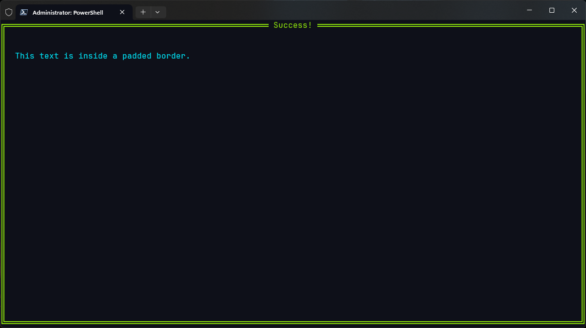
Example: Success Box
  auto message = std::make_shared<Text>("Operation completed successfully!");
  auto styled = BorderStyleBuilder()
      .set_color(ansi::FG_GREEN)
      .set_title("Success")
      .set_characters(BorderPreset::DOUBLE)
      .build();
  auto bordered = std::make_shared<Border>(message, styled);
This will render your message text inside a double-lined green border, titled "Success" at the top.
Output
TL;DR
- The
Bordercomponent wraps another component and adds a styled border around it. - Only one child is allowed inside a
Border. - Customize look and feel using
BorderStyleBuilder()- title, color, alignment, characters, and more. - Combine
BorderwithList,Flex, or nested layouts to create clear, modular UIs. Perfect for making sections feel grouped, highlighted, or just ✨ cleaner ✨.