Checkbox
The Checkbox component provides a standard way for users to toggle boolean options on and off. It's a fundamental element for building settings pages, forms, or any interface that requires true/false inputs.
The key design feature of Kontra's Checkbox is that it directly manipulates an existing boolean variable in your application via a pointer, creating a seamless two-way data binding.
Creating a Checkbox
To create a checkbox, you need two things: a label to display and a pointer to the boolean variable you want to control.
  // 1. In your application, define the boolean state variable
  bool show_advanced_settings = false;

  // 2. Create the Checkbox, passing the address of your variable using '&'
  auto checkbox = std::make_shared<Checkbox>(
      "Show Advanced Settings",
      &show_advanced_settings
  );
Now, whenever the user interacts with this checkbox, the value of show_advanced_settings will be automatically flipped between true and false.
Styling a Checkbox
A Checkbox has two visual states: normal (not focused) and active (focused). You can style these states using the CheckboxStyleBuilder.
Like the Button, this builder composes styles created with the TextStyleBuilder.
  // Define a style for when the checkbox is NOT focused
  auto normal_style = TextStyleBuilder()
      .set_color(ansi::FG_WHITE)
      .build();

  // Define a style for when the checkbox IS focused
  auto active_style = TextStyleBuilder()
      .set_color(ansi::FG_YELLOW)
      .set_background_color(ansi::BG_BRIGHT_BLACK)
      .set_bold(true)
      .build();

  // Combine them using the CheckboxStyleBuilder
  auto checkbox_style = CheckboxStyleBuilder()
      .set_normal_style(normal_style)
      .set_active_style(active_style)
      .build();

  // Apply the style to the checkbox
  auto styled_checkbox = std::make_shared<Checkbox>(
      "Enable Feature Alpha",
      &my_bool,
      checkbox_style
  );
Handling Input
You are responsible for managing focus and triggering the toggle action based on user input.
Keyboard Interaction
The standard UX is to use Tab to cycle focus and Spacebar to toggle the state of the active checkbox.
  std::vector<std::shared_ptr<Checkbox>> checkboxes = { chk1, chk2 };
  int active_idx = 0;
  checkboxes[active_idx]->set_active(true);

  kontra::run(screen, [&](const InputEvent& event) {
      if (event.type == EventType::KEY_PRESS) {
          if (event.key == '\t') { // Tab to move focus
              checkboxes[active_idx]->set_active(false);
              active_idx = (active_idx + 1) % checkboxes.size();
              checkboxes[active_idx]->set_active(true);
          } else if (event.key == ' ') { // Space to toggle
              checkboxes[active_idx]->toggle();
          }
      }
  });
Mouse Interaction
You can also allow users to click directly on a checkbox to toggle it.
  if (event.type == EventType::MOUSE_PRESS) {
      for (size_t i = 0; i < checkboxes.size(); ++i) {
          if (checkboxes[i]->contains(event.mouse_x, event.mouse_y)) {
              // Toggle the state of the clicked checkbox
              checkboxes[i]->toggle();

              // Optional: update focus to the clicked checkbox
              checkboxes[active_idx]->set_active(false);
              active_idx = i;
              checkboxes[active_idx]->set_active(true);
              break;
          }
      }
  }
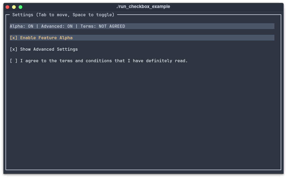
Complete Example
This example combines three checkboxes, a dynamic text display to show their state, and full keyboard/mouse control.
  #include "../include/kontra.hpp"
  #include <vector>
  #include <string>
  #include <memory>

  int main() {
      // --- 1. Application State ---
      bool option1 = false, option2 = true, option3 = false;

      // --- 2. Define a Reusable Style ---
      auto checkbox_style = CheckboxStyleBuilder()
          .set_normal_style(
              TextStyleBuilder().set_color(ansi::FG_WHITE).build()
          )
          .set_active_style(
              TextStyleBuilder()
                  .set_color(ansi::FG_YELLOW)
                  .set_background_color(ansi::BG_BRIGHT_BLACK)
                  .set_bold(true)
                  .build()
          )
          .build();

      // --- 3. Create Checkbox Components ---
      auto chk1 = std::make_shared<Checkbox>("Enable Feature Alpha", &option1, checkbox_style);
      auto chk2 = std::make_shared<Checkbox>("Show Advanced Settings", &option2, checkbox_style);
      auto chk3 = std::make_shared<Checkbox>("I agree to the terms.", &option3, checkbox_style);

      // --- 4. Create a dynamic text display ---
      auto display = std::make_shared<Text>([&]() {
          return "Alpha: " + std::string(option1 ? "ON" : "OFF") +
                 " | Advanced: " + std::string(option2 ? "ON" : "OFF");
      });

      // --- 5. Focus Management & Layout ---
      std::vector<std::shared_ptr<Checkbox>> checkboxes = {chk1, chk2, chk3};
      int active_idx = 0;
      checkboxes[active_idx]->set_active(true);

      auto layout = std::make_shared<List>();
      layout->add(display);
      layout->add(chk1);
      layout->add(chk2);
      layout->add(chk3);
      layout->set_gap(1).set_padding(1);

      auto screen = std::make_shared<Screen>(
          std::make_shared<Border>(layout,
              BorderStyleBuilder().set_title("Settings (Tab/Space)").build()
          )
      );

      // --- 6. Event Loop ---
      kontra::run(screen, [&](const InputEvent& event) {
          if (event.type == EventType::KEY_PRESS) {
              if (event.key == '\t') { // Tab to move focus
                  checkboxes[active_idx]->set_active(false);
                  active_idx = (active_idx + 1) % checkboxes.size();
                  checkboxes[active_idx]->set_active(true);
              } else if (event.key == ' ') { // Space to toggle
                  checkboxes[active_idx]->toggle();
              }
          } else if (event.type == EventType::MOUSE_PRESS) {
              for (size_t i = 0; i < checkboxes.size(); ++i) {
                  if (checkboxes[i]->contains(event.mouse_x, event.mouse_y)) {
                      checkboxes[i]->toggle();
                      // Update focus on click
                      checkboxes[active_idx]->set_active(false);
                      active_idx = i;
                      checkboxes[active_idx]->set_active(true);
                      break;
                  }
              }
          }
      });

      return 0;
  }
Output
TL;DR
- Create a
Checkboxto directly control a boolean variable in your app. - Pass a pointer to your boolean state using the
&operator. - Style the
normalandactivestates using theCheckboxStyleBuilder. - Handle
KEY_PRESS(' ' and '\t') andMOUSE_PRESSto manage focus and toggling.