The RadioGroup
component is used to present a list of options where only one can be selected at a time. It's perfect for settings, difficulty selection, or any single-choice scenario.
The design consists of two parts:
RadioGroup
container that manages the state.Radio
buttons that are managed by the group.Like the Checkbox
, the RadioGroup
directly manipulates an integer variable in your application that represents the index of the currently selected option.
To create a RadioGroup
, you need:
std::vector<std::string>
containing the labels for each option.int
variable that will store the index of the selected option.The RadioGroup
will automatically create the individual Radio
buttons and manage which one is checked based on the value of selected_index
.
You style the RadioGroup
by creating a RadioStyle
and passing it to the constructor. This style will be applied to all the individual Radio
buttons within the group.
The RadioStyle
defines the appearance for a button's normal
(not focused) and active
(focused) states.
The RadioGroup
component exposes its own methods for handling user input, which simplifies your main event loop.
The standard UX is to use arrow keys (Up
/Down
) to move focus and Spacebar
or Enter
to select the focused option.
focus_next()
: Moves the focus to the next radio button in the list (and wraps around).focus_previous()
: Moves the focus to the previous button.select_active()
: Sets your integer state variable to the index of the currently focused button.The RadioGroup
also provides a single method to handle all mouse clicks within its bounds.
The handle_mouse_press
method will automatically update both the focus and the selection to the clicked radio button.
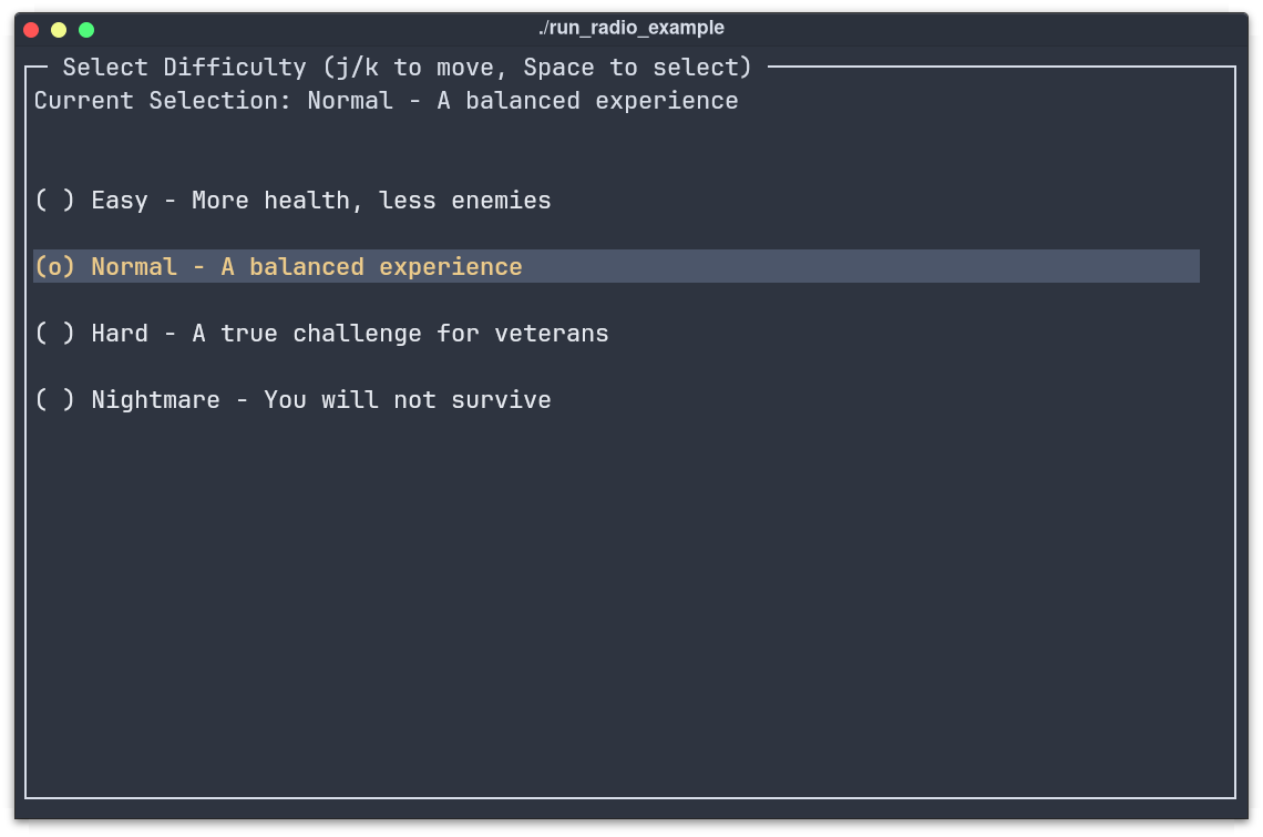
This example creates a "Select Difficulty" menu, a common use case for radio buttons.
RadioGroup
to manage a single selection from multiple options.std::vector<std::string>
for the labels and a pointer to an int
for the selected index.focus_next()
, focus_previous()
, and select_active()
for keyboard control.handle_mouse_press()
to delegate mouse clicks to the group.
// 1. In your application, define the state variables
std::vector<std::string> options = {"Option A", "Option B", "Option C"};
int selected_index = 0; // 'Option A' is selected by default
// 2. Create the RadioGroup, passing the address of your index variable
auto radio_group = std::make_shared<RadioGroup>(options, &selected_index);
// Define a style for when a radio button is NOT focused
auto normal_style = TextStyleBuilder()
.set_color(ansi::FG_WHITE)
.build();
// Define a style for when a radio button IS focused
auto active_style = TextStyleBuilder()
.set_color(ansi::FG_YELLOW)
.set_background_color(ansi::BG_BRIGHT_BLACK)
.set_bold(true)
.build();
// Combine them using the RadioStyleBuilder
auto radio_style = RadioStyleBuilder()
.set_normal_style(normal_style)
.set_active_style(active_style)
.build();
// Apply the style to the radio group
auto styled_group = std::make_shared<RadioGroup>(
options,
&selected_index,
radio_style
);
kontra::run(screen, [&](const InputEvent& event) {
switch(event.type) {
case EventType::KEY_UP:
case EventType::KEY_LEFT:
radio_group->focus_previous();
break;
case EventType::KEY_DOWN:
case EventType::KEY_RIGHT:
radio_group->focus_next();
break;
case EventType::KEY_ENTER:
// You can also handle KEY_PRESS for ' ' (spacebar)
case EventType::KEY_PRESS:
if (event.key == ' ') {
radio_group->select_active();
}
break;
}
});
if (event.type == EventType::MOUSE_PRESS) {
// Delegate the click event to the group.
// It will figure out which internal button was clicked.
radio_group->handle_mouse_press(event.mouse_x, event.mouse_y);
}
#include "../include/kontra.hpp"
#include <vector>
#include <string>
#include <memory>
int main() {
// --- 1. Application State ---
std::vector<std::string> difficulty_options = {
"Easy - More health, less enemies",
"Normal - A balanced experience",
"Hard - A true challenge for veterans",
"Nightmare - You will not survive"
};
int selected_difficulty = 1; // Start with "Normal" selected
// --- 2. Define a Style ---
auto radio_style = RadioStyleBuilder()
.set_normal_style(TextStyleBuilder().set_color(ansi::FG_WHITE).build())
.set_active_style(TextStyleBuilder().set_color(ansi::FG_YELLOW).set_background_color(ansi::BG_BRIGHT_BLACK).set_bold(true).build())
.build();
// --- 3. Create the RadioGroup Component ---
auto radio_group = std::make_shared<RadioGroup>(difficulty_options, &selected_difficulty, radio_style);
radio_group->set_gap(1);
// --- 4. Create a dynamic text display to show the state ---
auto display_text = std::make_shared<Text>([&]() {
return "Current Selection: " + difficulty_options[selected_difficulty];
});
// --- 5. Layout ---
auto layout = std::make_shared<List>(display_text, radio_group);
layout->set_gap(2);
auto screen = std::make_shared<Screen>(
std::make_shared<Border>(layout,
BorderStyleBuilder().set_title("Select Difficulty (Arrows/Space/Mouse)").build()
)
);
// --- 6. Event Loop ---
kontra::run(screen, [&](const InputEvent& event) {
switch (event.type) {
case EventType::KEY_UP:
case EventType::KEY_LEFT:
radio_group->focus_previous();
break;
case EventType::KEY_DOWN:
case EventType::KEY_RIGHT:
radio_group->focus_next();
break;
case EventType::KEY_ENTER:
case EventType::KEY_PRESS:
if (event.key == ' ') {
radio_group->select_active();
}
break;
case EventType::MOUSE_PRESS:
radio_group->handle_mouse_press(event.mouse_x, event.mouse_y);
break;
}
});
return 0;
}