InputBox and Input
The InputBox component in Kontra TUI lets users type and edit text within your terminal UI. It can be used alone or grouped using the Input component for forms and multi-field inputs.
Basic Usage
To use InputBox, create an instance and set it as active to receive keyboard input:
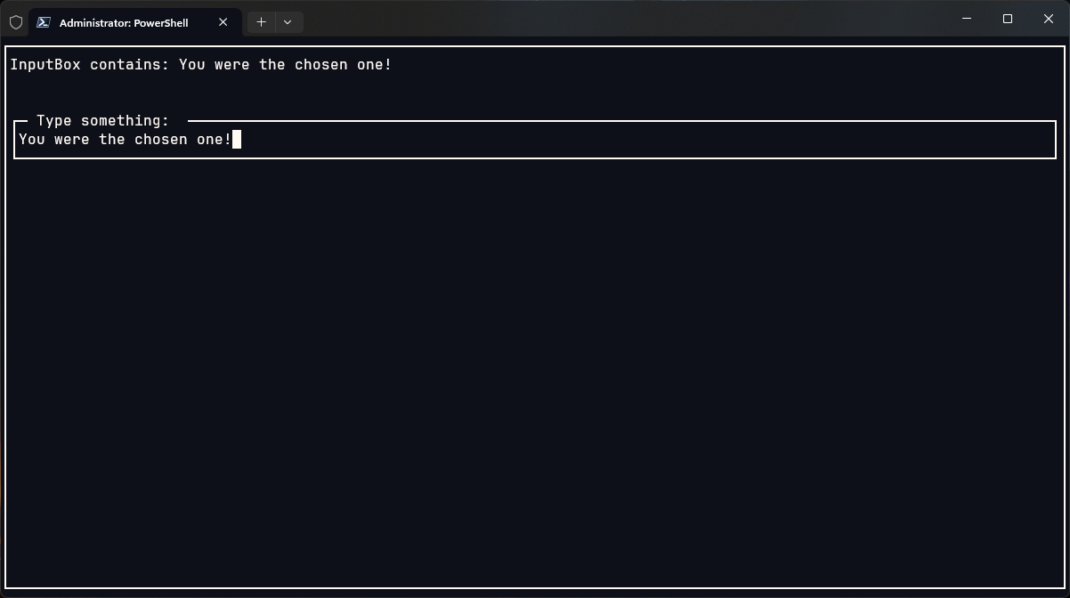
To render user input dynamically, you can "mirror" it using a reactive Text component:
Features & Options
You can customize InputBox behavior:
.set_label(...)- sets the label of the input.set_wrap_enabled(true)- enables text wrapping.set_active(true)- makes the input box focused by default.handle_input(char)- handles backspace, arrows, and character input.get_text()- retrieves the current user input
🧱 Layout Example
You can combine input and feedback like this:
And wrap the entire layout in a Screen with a Border-
🔁 Handling Input
The component doesn't require you to manually handle individual keys (like backspace or arrows). Just pass them directly:
Input Component
The Input component (not shown here) is a layout that contains multiple InputBox fields and manages tab switching, label alignment, and basic forms. It's perfect for:
- Sign-in / form screens
- Multi-field input
- Labelled inputs
Output
TL;DR
The InputBox is a simple but powerful way to capture text input in your TUI. Combine it with a reactive Text, a border, and layout tools like List to build neat form-like interfaces.
Want advanced forms? Pair multiple InputBox components with the Input layout and custom labels for complete control.